
Recently we introduced our new academy interface. During development, we started using some new techniques to help us improve our workflow, and maintain a high quality standard for our product. We prevent bugs from happening by working in a component-driven way, and testing often for unintended visual changes (visual regressions).
Component-driven development
In recent years a big trend in user interface development has been component-driven development (CDD). Components are the smallest pieces of self-contained functionality, that add value on their own. CDD anchors into this by creating a build process that works from the bottom up. You first create small components that tie into bigger components, which together make up a feature or a page. Think of it as a bike being made up of smaller parts. You start with creating two wheels, then a frame. Add a steering wheel, some pedals, and a chain. Now it starts to look like a bike. That’s how we developed the academy interface too.
We experience numerous benefits from working in a component-driven way:
Components are reusable. If you build a wheel, you can use it to build a bigger or a smaller bike, or maybe even a tricycle.
Small components are easy to understand.
Components are easily testable. You can test if the wheel works, you don't have to worry about the entire bike just yet.
Working with components often speeds up our development process by providing plug and play solutions.
Development is focused. It’s easy to keep track of component variations.
There are tools available to easily keep track of all available components that have been created by colleagues.
Some examples of components we have created are: a button, a pop-up window, a multiple choice answer, and also a complete login page.
Storybook enables us to develop components outside of our application in an isolated environment, without worrying about dependencies or breaking the application.
The story of our interface in Storybook
After creating lots of components that are the backbone of our interface, we organize them in Storybook. Storybook is a component explorer, or component library. It’s an efficient way to keep track of all our components. Each component gets its own story in Storybook, where all possible variations of a component can be viewed:
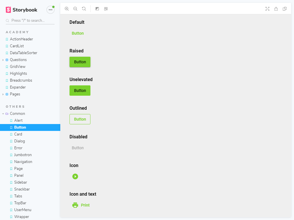 Button component in Storybook
For a button component, for instance, it is possible to view a default button, a raised button, an unelevated button, and a disabled button. It is also possible to interact with the component to see how that changes the component’s state or behavior. Type something in the login form for instance, and the input fields will tell you if the input is valid:
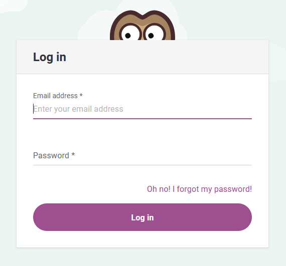 Login form component in Storybook
Storybook enables us to develop components outside of our application in an isolated environment, without worrying about dependencies or breaking the application.
We use Storybook as a design tool, as we adopted a story-driven design strategy. When we design, we are directly creating something that is valuable. Instead of creating wasteful Photoshop handoffs like we used to do before. When we add component stories to Storybook, we are automatically contributing to a living style guide, or user interface library. This means a developer can easily pick from a broad range of pre-made components to add to a feature they are creating. Causing our interface to be consistent and relatively cheap to develop:
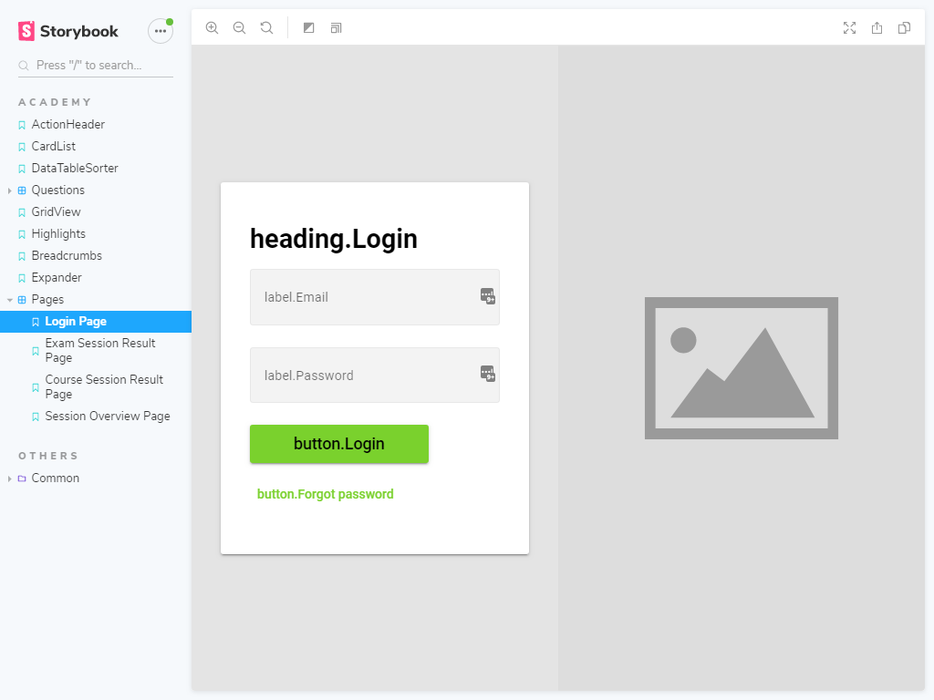 Login page component in Storybook
Using add-ons we extended Storybook, so that we can test the accessibility of each component. Making sure the interface stays accessible for users with certain restrictions:
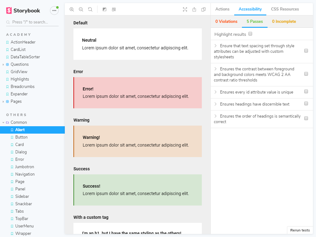 Accessibility checking in Storybook
Visual regression testing using Percy
Earlier we talked about visual regressions being unintended visual changes. To become aware of these visual changes, we use a tool called Percy. Percy is a visual regression testing tool that only cares about visual integrity.
With Storybook I can build and style components in isolation, and I always have an overview of the different scenarios I designed. With the help of Percy, I always know the impact of the changes I make.
Anouk
Front-End Developer & UX Designer
For each component we have developed in our Storybook component library, a screenshot is made. When we change a component a new screenshot is made, and the two are compared with each other side by side. Differences are then marked in red to show clearly what has changed:
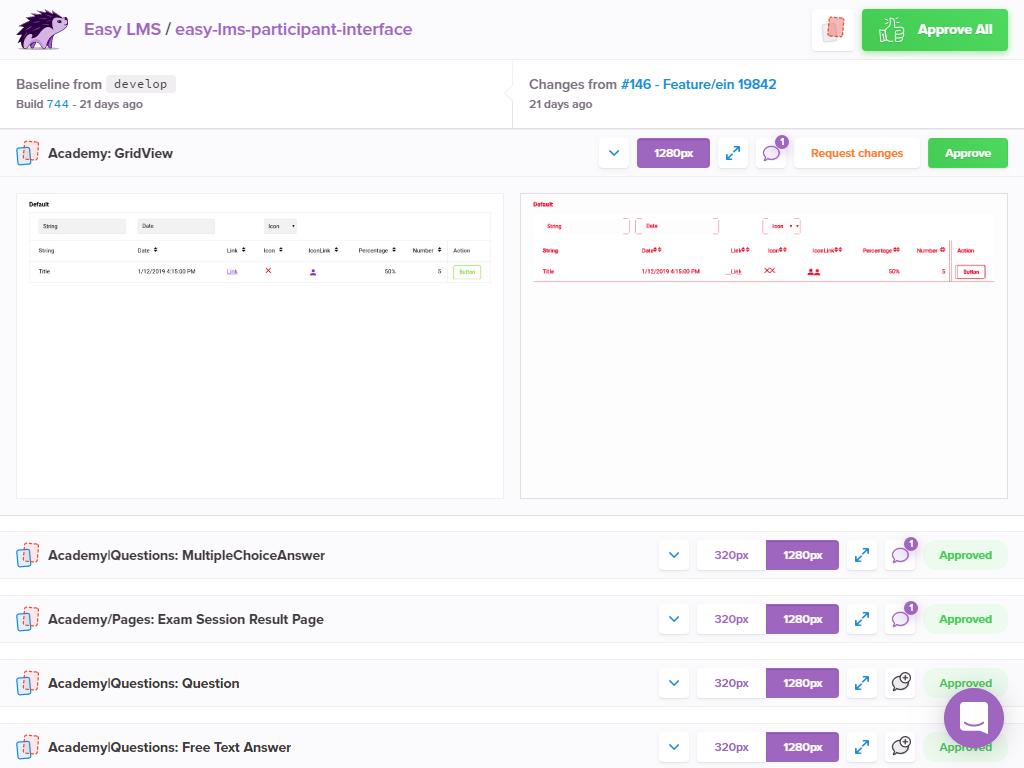 Regressions made visible in Percy
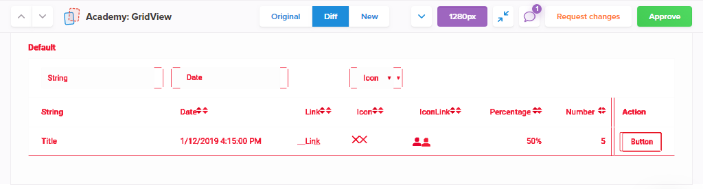 Differences between the old and new version are marked in red
Percy ties directly into our continuous integration pipeline (the flow from idea to reality), by notifying us of visual regressions before changes go live. After a review by one of the designers, changes are either accepted or denied. Percy also allows for a discussion on a certain change:
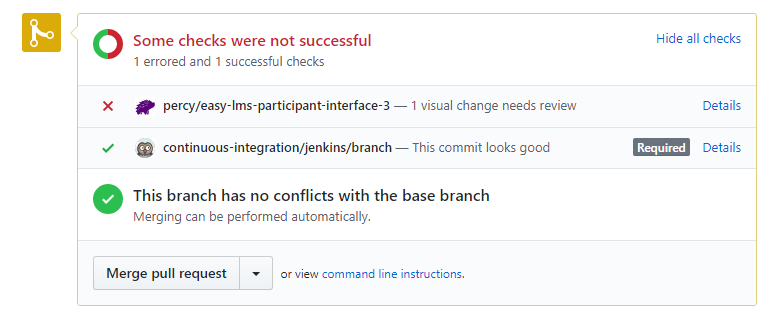 Percy integrated into our pipeline telling us something needs review
All this helps us to keep the unwanted visual changes from making their way to you, our end users. Did a visual bug happen to slip through anyway? Keep on reading to find out how we handle that in this article
Check out more of our blogs

Knowly
Your first month
When you have a new job, you're eager to get started! At the same time, there's always a healthy dose of nerves. What awaits you? What will your first weeks look like? And how quickly can you truly add value? The latter is our focus. Our clear onboarding program for software engineers will help you get to know our company, your colleagues, and your tasks in no time! Experience how we'll give you a kickstart!
Read more
Knowly
Behind the scenes of a client story and how to get involved!
Our clients are at the center of everything we do. We are in constant communication with users of our tool because your feedback helps us create more effective e-learning software. Your opinions guide other potential clients to enjoy the time-saving benefits of our LMS. Sharing your story with us is simple and can be done online or in person. Curious? Keep reading to discover what you can gain!
Read more

Anouk
7 common accessibility mistakes (and how to avoid them)
Optimizing the accessibility of your online product is essential, but how do you get started? We share a number of common accessibility mistakes and share useful tips on how to avoid them within your workflow.
Read more